
Introduction:
Echoes of Tradition and Pride in Every Shade and Line
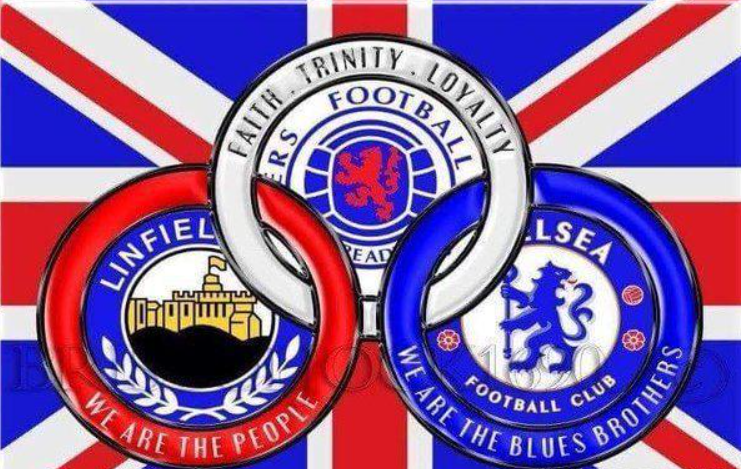
With an esteemed history stretching back over 150 years, the Rangers Football Club, also widely recognized as Rangers FC, embodies tradition and pride in the bustling world of football. Its signature colors – red, white, and blue – and its prominent crest do more than merely create an appealing visual presence on the football field. These elements paint a beautiful canvas of the club’s history, showcasing its enduring values and identity and binding its vast global fan base in a shared narrative of solidarity and achievement.
Color Symphony: The Meaningful Palette of Rangers FC
The club’s colors were not selected arbitrarily. Every shade in the Rangers FC palette, from the deep blue to the fiery red and pristine white, is a testament to the club’s spirit, values, and legacy.
The Ocean of Blue: An Emblem of Trust
Blue, the most dominant color in the Rangers FC palette, holds a deep significance. It’s a hue that traditionally symbolizes trust, loyalty, and wisdom – virtues that have become the cornerstone of the club. This color illustrates Rangers FC’s steadfast commitment to its supporters, its allegiance to maintaining a strong bond with its fan base, and the wisdom it has accumulated through various trials and triumphs in its illustrious history.
The Flame of Red: An Inextinguishable Desire
Red, a color that exudes passion, intensity, and desire, symbolizes the burning ambition of the Rangers’ players. This lively hue encapsulates the club’s unwavering zeal and competitive spirit that fuel its pursuit of excellence. It is a visual representation of the fire that burns within the club, illustrating its tenacity, unyielding endurance, and tireless striving toward unparalleled success.
The Canvas of White: A Testament to Integrity
Lastly, white, symbolic of purity, innocence, and integrity, stands for Rangers FC’s firm adherence to the principles of sportsmanship. This color represents the club’s strong belief in maintaining ethical standards on and off the field. The presence of white in the club’s palette is a reminder of the importance of fair play, honesty, and transparency in the beautiful game of football.
The Iconic Crest: A Chronicle in Design
Alongside the narrative spun by the colors, the Rangers FC crest tells its fascinating tale, imbued with symbolism and history. Since the club’s establishment in 1872, it has donned three primary badges, each marking distinct eras in its journey, each a signpost on the road of its development and growth.

The Emblem of Fortitude: The Original Crest
The original crest, introduced in the early 1950s, featured a rampant lion and the club’s initials – RFC. The lion, a universal symbol of strength and courage, mirrors the spirit of Rangers FC and their courageous pursuit of victory, reflecting the courage it takes to face any opponent and the power to overcome any challenge.
Commitment Enshrined: The Second Era Crest
In 1959, the club adopted a new crest to symbolize a critical period of transformation. This design incorporated a football, the club’s initials, and the iconic rampant lion, all encompassed within a circular belt and buckle design. This motif, common in Scottish heraldry, is an emblem of fidelity, a testament to Rangers FC’s unwavering commitment to its fans, its principles, and its pursuit of footballing excellence.
The Epitome of ‘Ready’: The Modern Crest
It signifies a readiness to tackle any adversity, a testament to the undying spirit of Rangers FC. This motto encapsulates the ambitious drive that has seen Rangers FC consistently emerge as one of the leading football clubs, ready to seize every opportunity, ready to triumph over any hurdle, and ready to win, regardless of the odds.

The Harmonious Fusion: Colors and Crest
The potent trinity of red, white, and blue and the symbolic crest combine to create a visual identity that is much more than a symbolic representation. The vivid shades of red, white, and blue, harmoniously co-existing with the evocative crest, inspire a sense of tradition, unity, and pride within the Rangers community.
Conclusion:
Rangers FC’s colors and crest are far more than symbols of a football club; they represent an identity transcending football, expressing shared values, and a chronicle of a rich and illustrious history. These potent symbols weave together tales from the club’s glorious past, portray the dynamism of its present, and even give glimpses into its promising future.
Rangers FC’s colors and crest are a colorful tribute to its rich heritage. This heritage has been constructed on the strong pillars of loyalty, courage, and readiness. These enduring symbols are a testament to the club’s indomitable spirit, steadfast commitment to its values, and unwavering ambition to excel. Through each shade of color and every line of the crest, the tale of Rangers FC continues to unfold, capturing the hearts of fans worldwide and cementing its place in the annals of football history.
More than an emblem on a jersey or a flash of colors on the field, these symbols hold in their heart the essence of Rangers FC, narrating an intricate story of resilience, ambition, and triumph that continues to inspire generations of football enthusiasts.