
A Bold New Look Unveiled
The name Real Madrid resonates with a sense of reverence and awe in the football universe, primarily due to the club’s illustrious history and consistent high-level performance. Each season, the outfits donned by this esteemed football institution embody the club’s identity and a rich tradition of style and grandeur synonymous with the name Real Madrid. The away kit for the 2010-11 season, in particular, presents a striking example of the design ingenuity that perfectly encapsulates the essence and ethos of Los Blancos.

The Power of Color: An Elegant Dark Shade
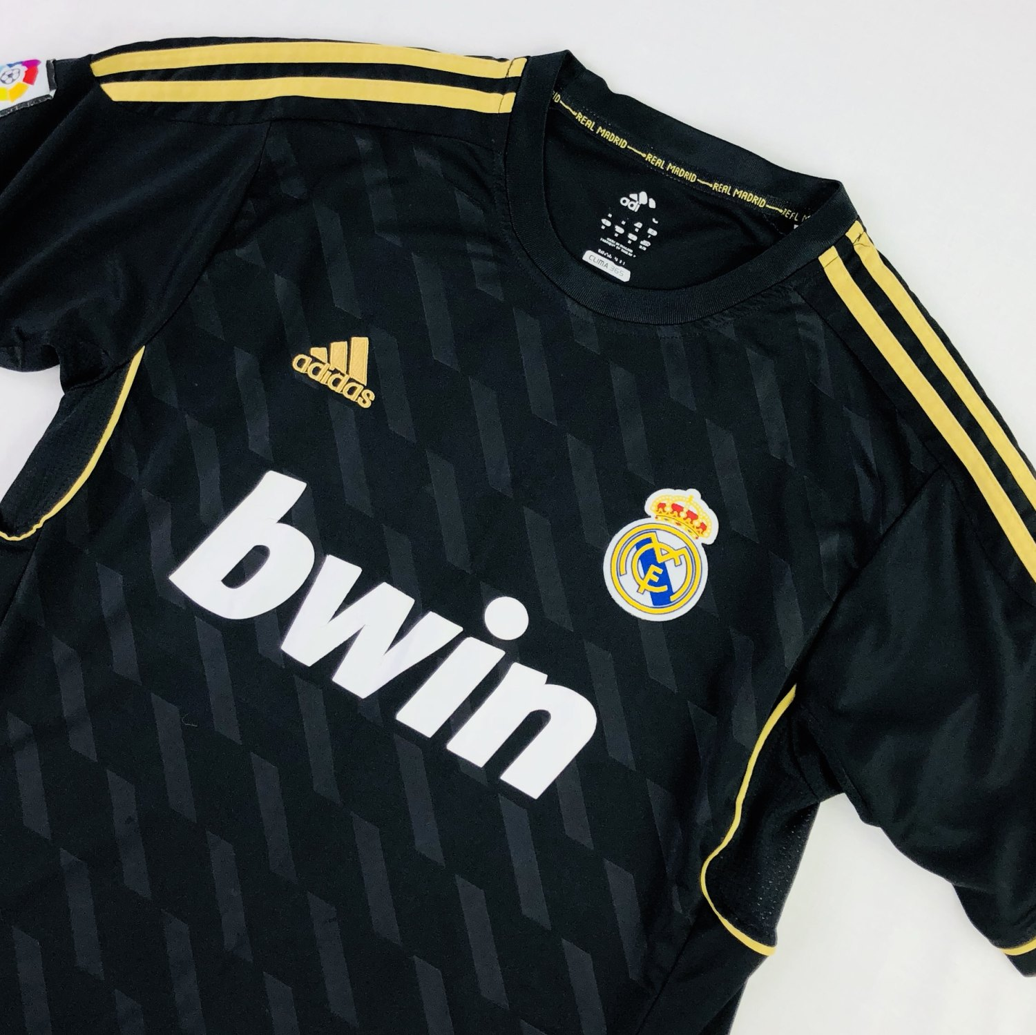
The away kit for the 2010-11 season distinguished itself through its sophisticated dark shade, a notable departure from Real Madrid’s traditional crisp white home kit. The dark backdrop exuded a mature elegance, making the team’s players appear even more formidable on the field. This backdrop served as a canvas for the iconic white stripes from Adidas that gracefully adorned the shoulders, emphasizing the collaborative relationship between the team and the sportswear giant and highlighting the unity that binds the group. The stripes provided a visual break from the uniformity of the dark shade, striking a perfect balance in the overall color scheme.
Intriguing Green Accents: A Touch of Vibrancy
What truly elevated the design of this kit was the unexpected incorporation of bright green thin lines. Running along the collar and the sides of the body, these green accents offered a lively contrast to the dark backdrop, infusing a youthful dynamism into the mature and elegant color scheme. This unusual touch of color underscored the daring creativity of the design process, distinguishing the kit from many others and highlighting the spirit of innovation that runs deep in the club.
The Emblem of Pride: The Heart of the Kit
Keeping in step with the design choice for the home kit, the away equipment proudly showcased the radiant club emblem on the left chest area. This emblem, serving as the epicenter of a radiating burst of light, symbolized the illustrious status of the star-studded team and served as a constant reminder of the club’s rich heritage. This design element beautifully encapsulated the pride, loyalty, and respect each player carries for the team and its history.
Celebrating the Collaborative Ingenuity with Adidas
While the 2010-11 away kit represented Real Madrid’s ethos, it was also a tribute to the club’s enduring relationship with sportswear titan Adidas. The iconic white Adidas stripes on the dark kit embodied this collaborative triumph. The sophisticated juxtaposition of these two dominant hues made a fashion statement and celebrated the synergistic rapport between the team and Adidas. As partners, both entities have continually pushed boundaries, using the canvas of sportswear to reflect the spirit of constant innovation and shared aspirations.

Subtle yet Impactful Design Elements
The small but impactful design elements further enhanced the aesthetic appeal of the kit. The bright green accents, while not traditionally associated with the club’s color scheme, offered an unexpected pop of color, bringing a part of freshness and vibrancy. This lively color subtly traced the neckline and the sides of the body, adding a touch of finesse to the design. Incorporating such intricate details testified to the thoughtfulness invested in the design process, making the kit a piece of sportswear and a work of art.
The Emblem – A Radiating Beacon
The prominent Real Madrid emblem on the left chest area was central to the design. This emblem, radiating outwards, was not just an aesthetic choice; it represented the essence of Real Madrid. Every line emanating from the crest symbolized the far-reaching impact of the club, its widespread fan base, and its influence in the world of football. It was a powerful reminder of the club’s stellar lineup and the brilliance that Real Madrid continually brings to the field.
Conclusion: A Testament to the Spirit of Real Madrid
In conclusion, Real Madrid’s 2010-11 away kit embodied the club’s spirit. Its careful interplay of colors, thoughtful design details, and meaningful representation of the club emblem together made it much more than a football uniform. It was a testament to the team’s past and present, a visual picture of its grandeur, and a beacon shining light on its continued path of excellence. As fans worldwide donned this kit, they became part of Real Madrid’s journey, wearing a piece of history and an emblem of their allegiance.

The Future of Football Kits
Real Madrid’s 2010-11 away kit set the benchmark for future football kits with its balance of aesthetics, symbolism, and creativity. It challenged the conventional approach to designing football kits, proving that these pieces could be stylish and full of character, all while staying true to the team’s spirit. It opened up a realm of possibilities for
incorporating innovative elements, bold color combinations, and meaningful symbols into the design of sportswear. As such, the 2010-11 away kit continues to be a shining example of the dynamic fusion of style, spirit, and storytelling in football kits.